

So what is Composition?
Quite simply, composition is “The act of combining parts or elements to form a whole.”
And so, the goal of good composition is to intentionally arrange the elements and parts of your drawing to better engage with your audience, sustain their interest and elicit a response.
We need to understand what makes good composition because we essentially want to turn our viewer on and deliberately guide them across our image and ultimately, better express our idea, story or theme!
Let’s first look at our greatest source of inspiration… nature! Whatever set the forces of nature in motion is mystery, but we have to agree that certain principles govern us, and typically determine what appeals and what doesn’t. These key principles also influence the nature of effective design & composition.
Visual Hierarchy
Every composition within a painting, drawing or piece of design should always have what's known as a Visual Hierarchy. This is basically a structured order to the visual, e.g If you're drawing a landscape with a man and a dog and a castle, then it needs to be desided which of these 3 elements will be first, which will be second and which will be third.
It is by utilising various types of compositional rules and structure outlined in this tutorial that will help you to reinforce your desired visual hierarchy.
Rules of Composition
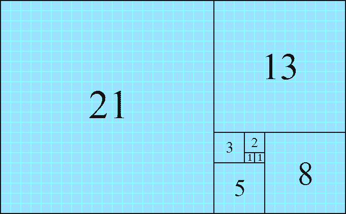
The Fibonnaci Sequence
Coincidentally, this principle is verified by a completely different principle seen throughout nature; The Golden Ratio.
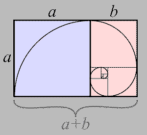
The Golden Ratio
The result of this formula delivers the special number Pie 1.681, which is the ratio used by nature when dividing or multiplying organic matter.
The Middle Line
It’s not the type of composition to be used all the time, but can be effective with more simple composition when placing key elements along this centre line.

The Rule Of Odds
It’s an unwritten rule, but it’s believed that an odd number of subjects is more engaging than an even number of subjects. If you have more than one subject in your picture, the suggestion is to choose an arrangement with at least three subjects, and usually just 3 since 5, 7 or more just becomes visual clutter.

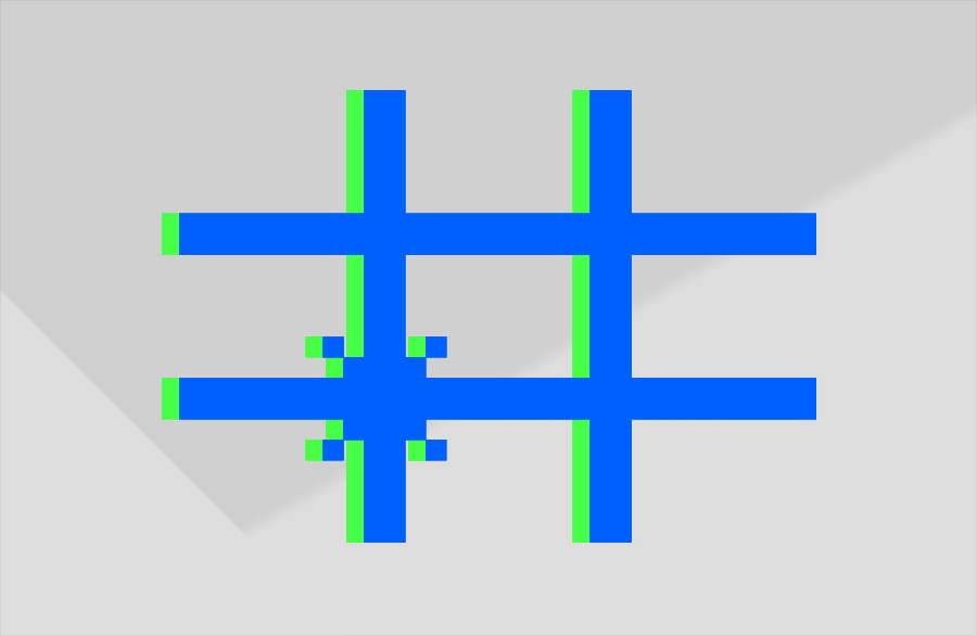
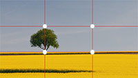
The Rule Of 3rds
Types of Structure within Composition
These rules of composition alone are a great starting point for good composition, but there’s a lot more we need to consider when arranging the elements of our image within the composition.
These are what I’ve categorized as compositional structures, and revolve around focus points used in your image.
Single Point Structure
A Single Point structure is when your image has just a single main focus point. It’s usually situated somewhere on the main subject that you want people to see first. Anything else in the image supports this single point.
Frank Frazetta
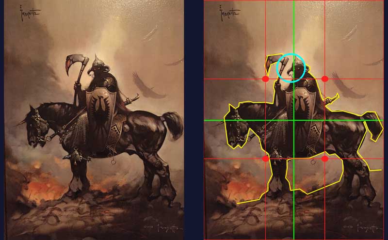
This is single point composition structure by the legend frank frazetta. It sits within a Middle Line Composition setup; we are immediately drawn into the eyes which rest along the vertical Middle line. The eyes of the horse sit on the horizontal middle line, perhaps to retain a little attention.
In terms of visual interest there’s some nice background depth with the eagle type birds flying about the smoke. He uses lighter tones for them to suggest distance. There’s also a strong silhouette and overall the shape of the subject is a very striking graphic composition that pulls the viewer in.
Dave Rapoza
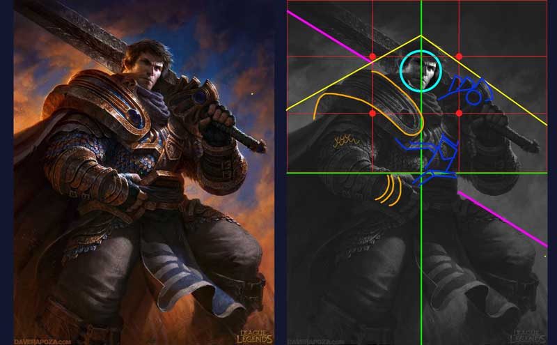
This is another single point structure by Dave Rapoza which also seems to sit within a Middle Line composition. Once again, the eye happens to rest upon the vertical centre line, there is power in this line! Could it be coincidence that the hand also sits upon the horizontal centre line?
If we break down the shapes we can see how it has a sense of symmetry with triangular angles from the head. A triangle represents power and stability which complements the nature of the character in this illustration. Some asymmetry comes into play with the sword and the leg to add some variety and visual interest to the static powerful pose. We can see some contrast in the design shapes; they’re consistent with a little variety thrown into parts which change the rhythm.
The background clouds are deliberately positioned to act as leading lines that point to the subjects face.
Although this is Middle Line composition, we can still see how the powerful rule of 3rds comes into play, the face is positioned just below 2/3rds of the way up from the middle.
Multipoint Structure
A multi-point structure is where your image has multiple focus points. Each focus point can be equally important, but more often than not there is one main point supported secondary, 3rd or 4th points.
Piotr Jablonski
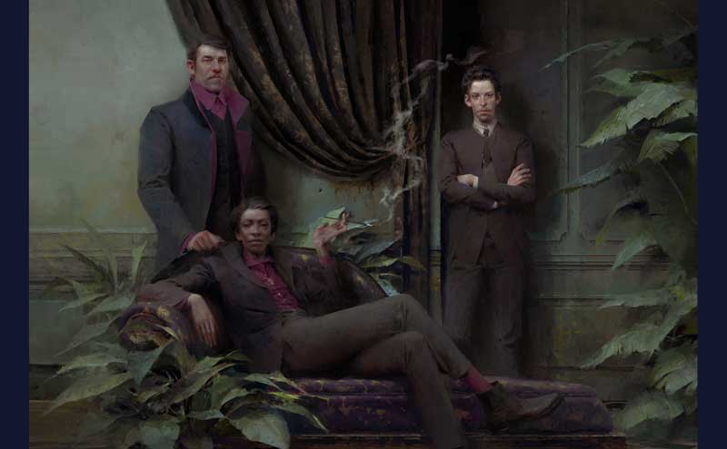
This is one of my favorite artists around today, Piotr Jablonski. In this image he uses a multi point structure which sits within a fusion of Middle Line and Rule of 3rds Composition.
The first point we see in the hierarchy is the man’s face. We see him first because there’s more contrast between between lights and darks, and because he stands over one of the rule of 3rds points.
The next face we see is the lady smoking the cigarette, who appears to be the main person in the frame, but the artist chose to introduce her 2nd. She sits between two focus points on the rule of 3rds grid and her eyes are perfectly aligned with the middle line. If you notice, the centre lines cross exactly at the point of her cigarette, which is a sub focus point, it always keep your attention coming back to centre.
Finally we have the 3rd main focus point, the man stood behind her. And so our interest fleets between these 3 points and the cigarette. Did you notice how the smoke also plays a role in linking these focus points? This is just one of the ways that the artist has added some visual interest to retain our attention and keep us in the image. He also uses some contrasting shapes and some leading lines to help to frame the composition.
Jessica Oyhenart

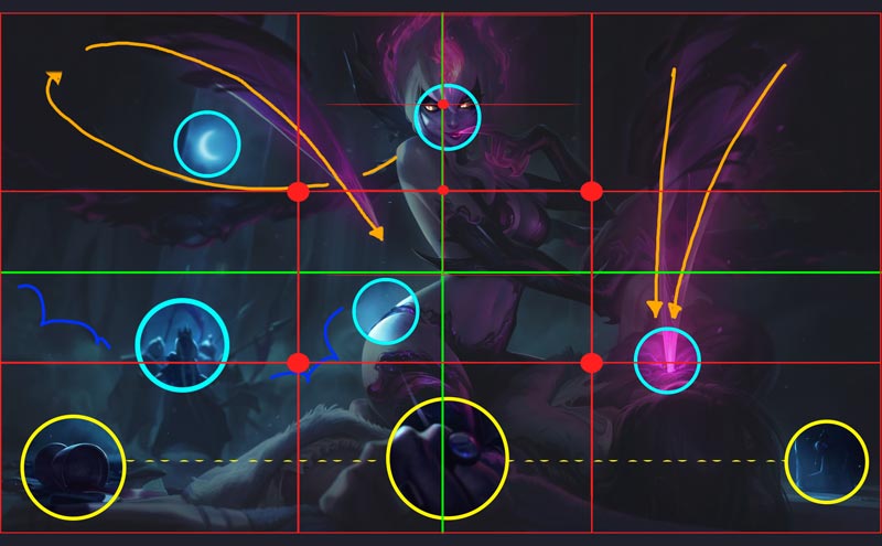
This next image by Jessica Oyhenart, a senior artists for riot games demonstrates a multi-point structure within a Middle line composition.
Once again, we see the eye falls just off the vertical centre line. Although it’s not a typical Rule of 3rds composition, if we break the top half into 3rds we see how the eye is laced next to one of the intersection points. This demonstrates the importance of 3rds in general.
The face is the main focus point due to the position, the contrast of lights, darks, unique colour of the eyes and the amount of concentrated detail in this particular space.
The next focus point falls onto the curve of her figure which suggest her sensual nature. The artist clearly wanted this idea to come across. Next we’re taken into the background where a fight occurs, then up to the moon and back around into the point where she’s inflicting pain onto her victim.
There are some sub focus points below which help to frame the subject and keep our eyes from exiting the image. Some of these points can be argued in terms of the visual hierarchy, they’re subjective depending on the viewer.
In terms of visual interest, there’s a great sense of depth within the image. There’s an emphasis of using blurs from the hand in the foreground through to the background fighters. The overlapping elements of the figures colliding help to add to this depth. There’s a sense of accurate perspective and the diagonals of the buildings add tension and pace to the image. There’s a very strong visual hierarchy overall.
Framed Structure
A framed structure basically consists of multiple elements that surround the main subject, or a primary focus point. It can be used retain the users interest and keep them within the image.
Karla Ortiz
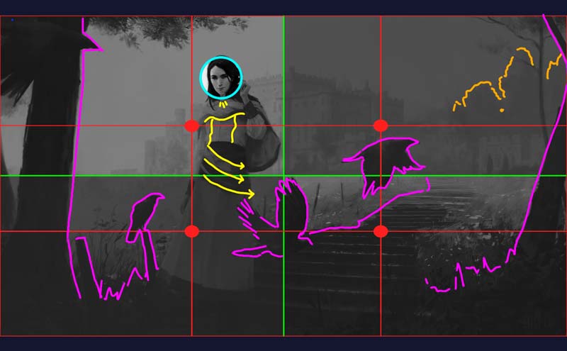
This next image is by the wonderful Karla Ortiz, it’s a classically framed structure and seems to fit within the rule of 3rds grid although the main focus point, the face is slightly to the right of the top left intersection. The rest of her body however sits across on the lower left intersection.
Her face has the highest contrast between the lights, darks and detail in the smallest amount of space. This makes her face pop off the page.
She is ultimately framed by the crows, trees and the steps which lead us into the backdrop.
There’s a great sense of depth in the image, the castle in the backdrop also helps the figure to stand out. The castle has less contrast between the lights and the darks which suggest the distance. As a rule of thumb; things in the distance always appear to have less contrast between the light and dark areas due to atmospheric perspective.
There’s also a good sense of flow to the design of her outfit. This helps to guide the viewer past the crows and towards the steps after initially seeing her face. The trees in the far distance are merely suggested with pattern and colour. This ensures the focus and attention is retained within areas of importance, and it offers a place for the eyes to rest. It also helps the viewer to engage with the painting by filling in any details with their imagination.
This image is also really well balanced, for example, the top left rectangle is quite busy where as the bottom right is more plain with much darker tones.
Jakub Rozalski
This image by Jakub Rozalski utilises a framed composition within the rule of 3rds. The focus point is the lady in front on the left as she’s placed on the lower left intersection point.
The vertical details in her skirt also help to draw in the viewer's attention to her. The main subject in the image is actually the central mech figure which is framed by the cluster of bodies in the field, as well as the other two mechs to the left and the right. The bright white light dot from the central mech also attracts our attention. The cluster of bodies seem to sit on the lower 3rd of the image, and the height of the mech seems finish at the 2nd 3rd of the image, once more reinforcing the power of 3rds. The use of depth seems to be very common within images that are captivating, and we see it here once more with the use of foreground, midground and far distant elements that merel suggest things for our brains to work out.
Path Structure
A path structure is a series of focus points littered across the image to guide the viewer toward the main focus point. Sometimes each focus point are equally important and end up creating a visual path or loop.
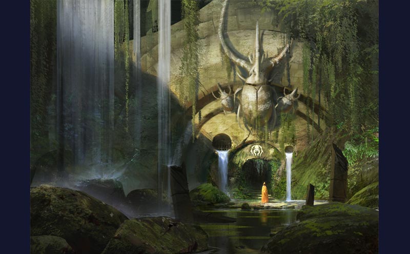
Eyton Zana
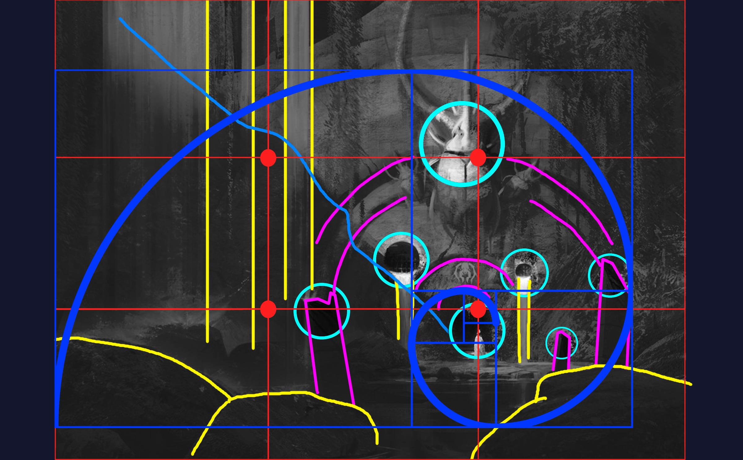
This next image by Eaton Zana utilises a variety of compositional structures. Primarily it uses the Rule of 3rds for the main focus point. The figure is the brightest part of the image which makes it stand out even more, it is a high contrast point. You can see how the Golden Ratio comes into play with the arrangement of elements within the scene. It’s busier in the focus areas and the details gradually taper off.
This is predominantly a single point composition but it’s fortified by a path like set of structures, various other focus points are littered around the main focus point. You could also argue that this has a framed type of structure, as we see the pink areas fully contain the main focus point.
There’s some really nice visual interest added, the straight and curved lines go really well together, the streamlined waterfalls help to separate and balance the rest of the scene within the darkness. There is also a leading line seen in blue; this shadow cuts into the scene and leads your eye to the main focus point.
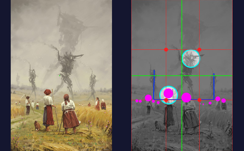
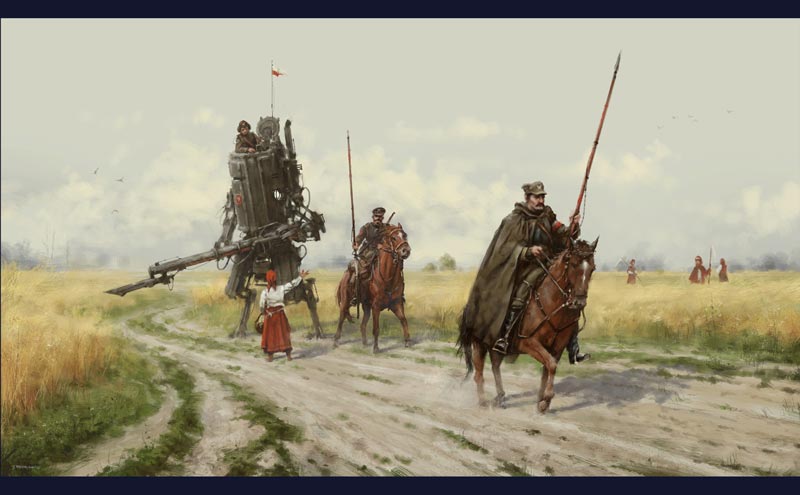
Jakub Rozalski
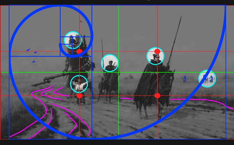
Another image here by Jakub Rozalski demonstrates some sound composition which seems to utilise a lot of the compositional rules.
It’s a fusion of the rule of 3rds and the Golden ratio with multiple path of focus points within it.
The top main mech figure dominates the top left intersection with the woman who is 2nd in the visual hierarchy adds to the clump of details which ultimately captures your interest. With regards to the golden ratio, the busiest part of the image is in the main left section which then tapers off as we spiral out.
The other 2 men riding horses form a path type of structure by becoming additional focus points. When we look at the image as a Middle Line structure, we can see some correlations with the horses placed at intersections, the middle man is next to the vertical middle line, and the top of the 2nd horses head is inline with horizontal middle line, which also separates the land and the sky. The rider of the 2nd horse is also placed on a rule of 3rds intersection point.
Overall this image is visually interesting with the a high level of depth and detail in certain areas, some overlapping elements, leading lines and a generally nice rhythm of busy and calm areas for the eye to rest . There is also contrast in the scene in terms of mood; a beautiful natural scene clashes with dangerous soldier type figures.
Symmetrical & A-symmetrical Structure
Symmetrical structure is where two sides appear the same being reflected from a centre line in the middle of an image. A symmetry occurs when one side has slightly different elements and breaks the mirrored reflection.
Leonardo Da Vinci
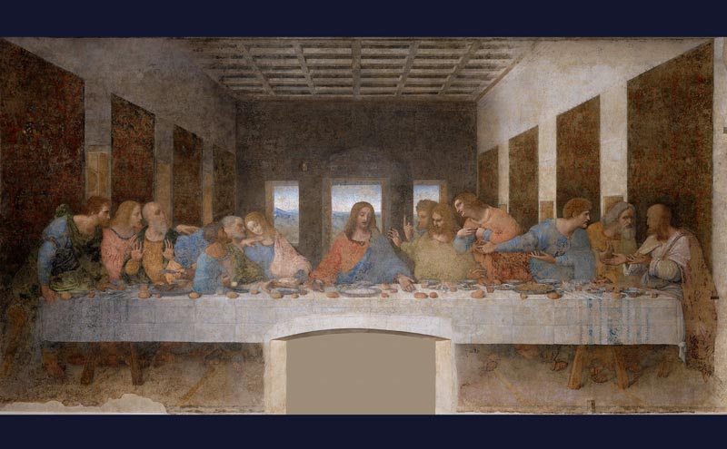
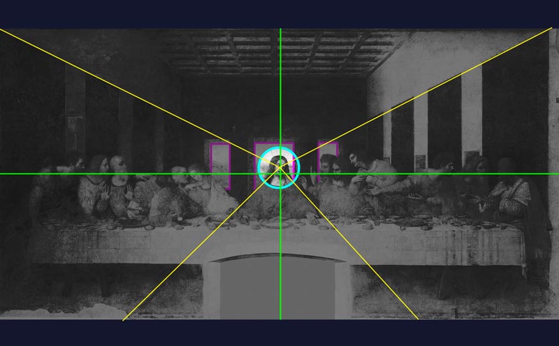
Symmetrical designs are less common today but were very popular in older paintings, and typically associated with religious works. Symmetry represents unity, balance and the divine. This is the last supper by Leonardo Da Vinci, it utilises a Single Point and Symmetrical Structure within a Middle Line Composition.
First thing we notice is the placement of Jesus. Absolutely central to the image, as the rest of the figures are balanced along this middle line. Jesus is contrasted by the bright window behind him which makes him pop out.
The perspective lines all converge onto Jesus’s face. When condensing the values, it appears as though the left side is a lot darker than the right, this perhaps helps to balance out the image. Obviously the figures on either side appear different which introduces asymmetry into the scene.
Raffael
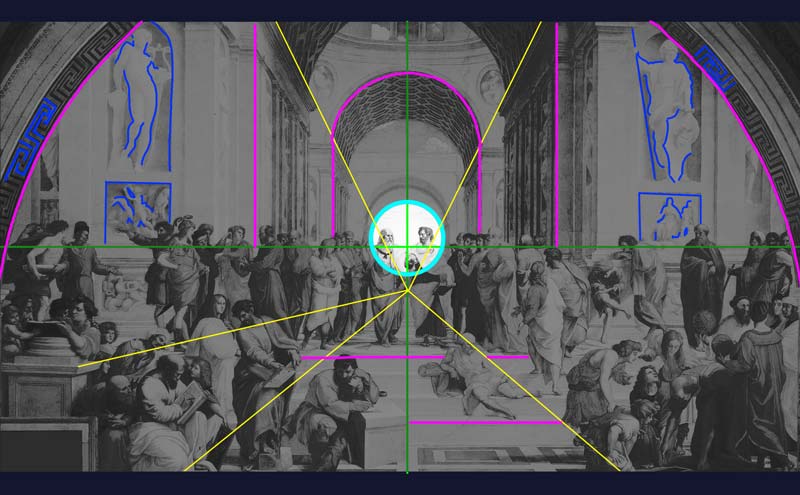
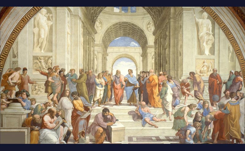
And another older painting by Raffael, the School of Athens adopts a mixture of single point, leading lines and framed structure within a Middle Line Composition.
The vanishing point is somewhere at the beginning of the path that they’re walking on, this is determined by the angles of other objects marked by the yellow lines. The pink lines show how the figures are framed within the image by surrounding objects.
There’s a variation of shapes for unity with variety in this image to give it some overall visual interest.
Leading Lines Structure
A leading lines structure is a where there are distinct lines that lead the eyes of the viewer toward a particular part or parts of the image.
Karla Ortiz
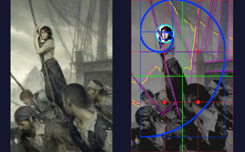
Karla Ortiz once again nails this painting with solid composition. There’s a sense of the golden ratio that comes into play with the rule of 3rds, and arguably the middle line, which seems to separate the image into lights and darks. The composition is structured by leading lines that seem to frame the main subject and the crew. This is also a single point composition in structure, but the eye does fleet across the crew members that help to frame the woman and keep the viewer from losing interest.
Again, there’s a nice sense of depth to the image for visual interest, and the suggestion of elements such as the mountains, ropes and sail aren’t at all detailed, but gives just enough to give them context within the image. This enables the details in the areas that matter such as the face to speak louder. It keeps our focus on the face, we’re always being pulled back to her gaze.
Piotr Jablonski
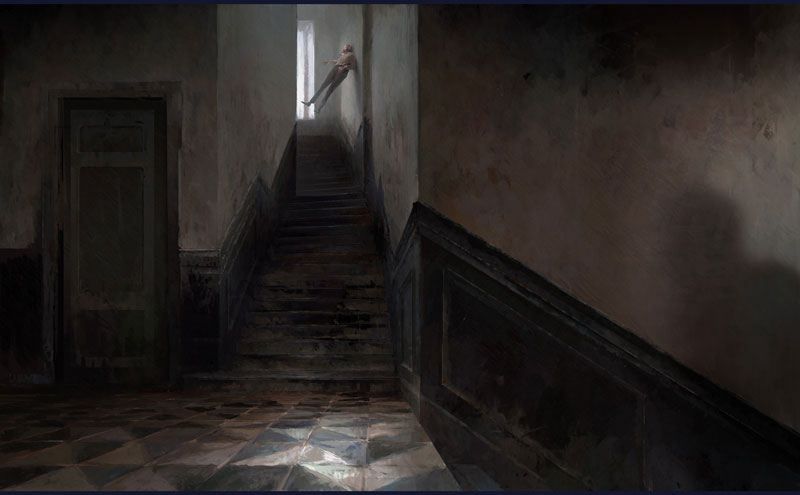
This final image by Piotr Jabłoński breaks all the rules. At first I couldn’t quite work it what type of compositional rule was in play, but it dawned on me that this image represents something very odd, and strange. It’s paranormal!
If we try to lay over the top the typical compositional grid rules, nothing seems to correlate, yet it still works.
Ultimately this image relies on the compositional structures in play and not compositional rules. The main structure used in this image are leading lines which guide the eye to the main focus point. The main focus is the figure by the window, but also attracts the viewer by being the brightest part of the image. This figure is place in an odd position, in the way that he’s floating, and stuck to a wall in a part of the image where focus points aren't’ usually placed.
However, it works… it lends to the idea of being paranormal by breaking conventions and deliberately made to appear odd.
The main focus is also framed by the door on the left, and the erie shadow figure looming offscreen. This is a trick used to stimulate the viewers imagination and open up the scene outside the frame.
In terms of visual interest, it’s very well balanced and there’s plenty of unity with variety, many horizontal, vertical and diagonal lines that contrast each other. The colour palette is also limited, but has a nice variety of colours within it.
Alternate Methods for balanced Compositions
Informal subdivision
This is a process of dividing up a frame by starting with vertical line and horizontal lines. They can be placed anywhere but usually not in places that suggest divisions of halves, thirds or quarters.
- First add in a vertical line anywhere in the canvas
- Then add a horizontal line
- Where they intersect add in diagonal lines where ever you see rectangles
- Add in a new vertical and horizontal lines where there are more intersections
- Continue to selectively draw within the subdivided space
Things to consider:
- Follow the lines
- Leave some areas as negative space
- Ensure the busiest parts of the image are where the most intersections are
Formal subdivision
This is a process of dividing up a frame into equally sized columns, usually 3 - 5. Lines are placed from corner to corner to divide the frame, and then additional diagonal lines are placed within other segments to divide the composition further.
- Divide the page into equal width columns; 3,4, 5+
- Add in the same number of lines vertically than there are horizontally
- Selectively Find rectangles and divide them with diagonal lines
Things To consider:
Treat the middle line of the frame as a mirror, and reflect each line you place on one side onto the other side.
Conclusion
Good composition is something that needs to be understood and learned if you want to create compelling art. These principles opperate on a passive level and make all the difference when it comes to retaining a viewers interest! It can be quite in depth, but this drawing tutorial provides a good base foundation to help you begin to understand and explore strong compositions in art and design.
You can use the Composition Task Generator to create composition related artworks and study the things outlined in this tutorial. This Task Generator guides your process and will help practice structuring your own ideas.
Next Steps to Improvement...
Memorize the different compositional rules, structures and implement them into your own artwork!
You can improve your composition & design skills by using the Composition Art Task Generator. It's dedicated to helping you learn the principles outlined in this drawing tutorial in a practical way; by prompting various drawing tasks with various criteria to explore different rules of composition and structures.
When approaching composition be mindful of:
- What is the main compositional rule & structure being used?
- What do you want to communicate the most?
- What are the main focus points?
- Does your image have a clear visual hierarchy?
| DRAWING TASKS |
![]() Video Tutorials
Video Tutorials ![]() Task Generators
Task Generators
| GET CRASH COURSE |